
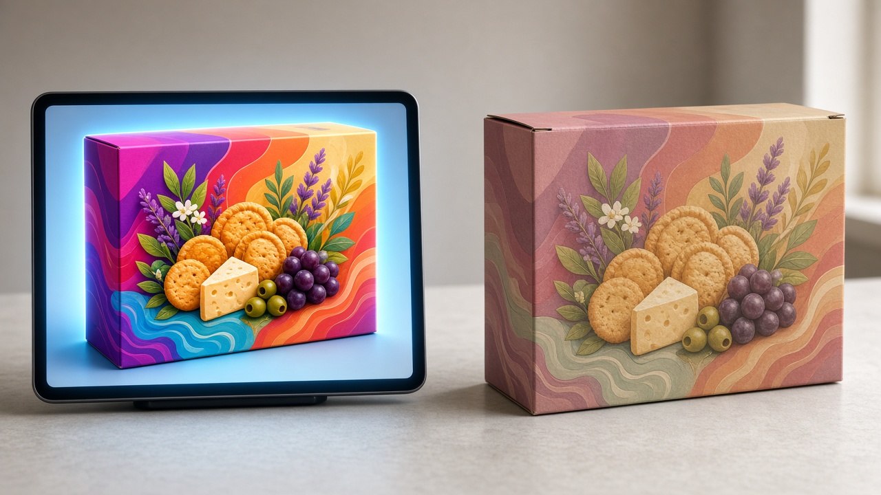
Eye-catching 3D, but the printed box is off-color why mockups still go wrong in print
A 3D preview is not a print-color certificate. Understand RGB/screen vs CMYK/paper and approve samples on the real substrate.
A 3D mockup on screen can look “on brand,” but the printed box comes out duller, off-shade, or with a completely different color feel. Many shops assume the printer got it wrong — sometimes that is a print-shop error, but very often it is expectations from a 3D image / screen that do not match real print color.
Understanding that gap helps you burn less money on sample after sample, and helps you talk to the printer in technical language instead of only “why is it different from the 3D photo?”
Why “correct” 3D still shifts when printed
3D previews and marketing mockup photos are optimized to look good on phones and computers. Packaging print is a totally different physical process. Common causes of color shift:
RGB vs CMYK: screens / 3D are usually RGB with a backlight — vivid color, high contrast. Offset/flexo/digital packaging print uses CMYK (or the plant’s press profile) on paper — a narrower gamut, no self-glow.
Substrate absorbs ink: kraft, ivory, duplex, matte- or gloss-laminated stock with the same CMYK file will feel different. Kraft “swallows” vividness; gloss lamination makes color look deeper and shinier.
Viewing light: approving a sample under warm shop lights is very different from daylight or the studio lights used to shoot 3D images.
“Sell-the-look” mockups: many 3D images boost saturation so the product looks appealing online — that is not a production color certificate.
Press and ink at the plant: the same file can still shift slightly between two printers if profiles/machines differ. You need a proof on the same line that will run the bulk job.
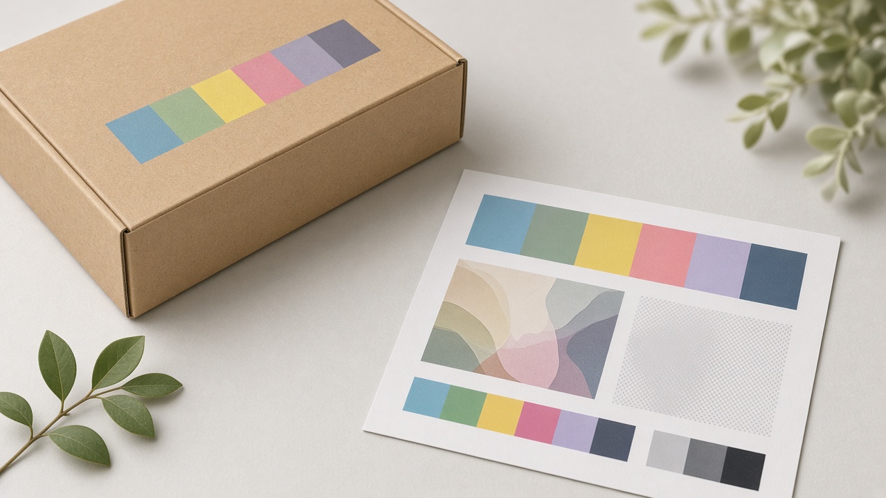
Don’t approve by eye on 3D alone
3D/preview is very useful for checking shape, layout, logo placement, type scale, and how the box looks from an angle. It is weak at committing to final Pantone/CMYK color.
Before locking a bulk run, you should have at least one of these steps:
A hard proof on the exact paper/board and finish you will use.
Controlled soft-proofing (if the plant/agency supports profiles) — still confirm with a real print for brand-critical jobs.
Compare color to brand guidelines (an approved prior sample, or a swatch) under consistent lighting — not only against a 3D photo on a phone in sunlight.
If the shop only “likes” the 3D image and tells the plant to match it, both sides are signing an expectation contract that almost cannot match 100%.
A 4-step process to reduce color shift
Lock a print-oriented target color: write the target CMYK/Pantone (if any), or a relative description vs a previously approved sample — not only “red as nice as on the mockup.”
Export plant-ready files: correct required profile, correct bleed; don’t leave vivid RGB images and expect the press to magically become on-brand.
Proof on the real substrate: same paper weight, same matte/gloss finish when possible. A proof on different paper is layout reference only.
Approve sample → controlled edits → bulk: each color tweak should be logged (how much C/M/Y/K up/down, or which swatch changed) instead of adjusting “by feel” and losing the version.
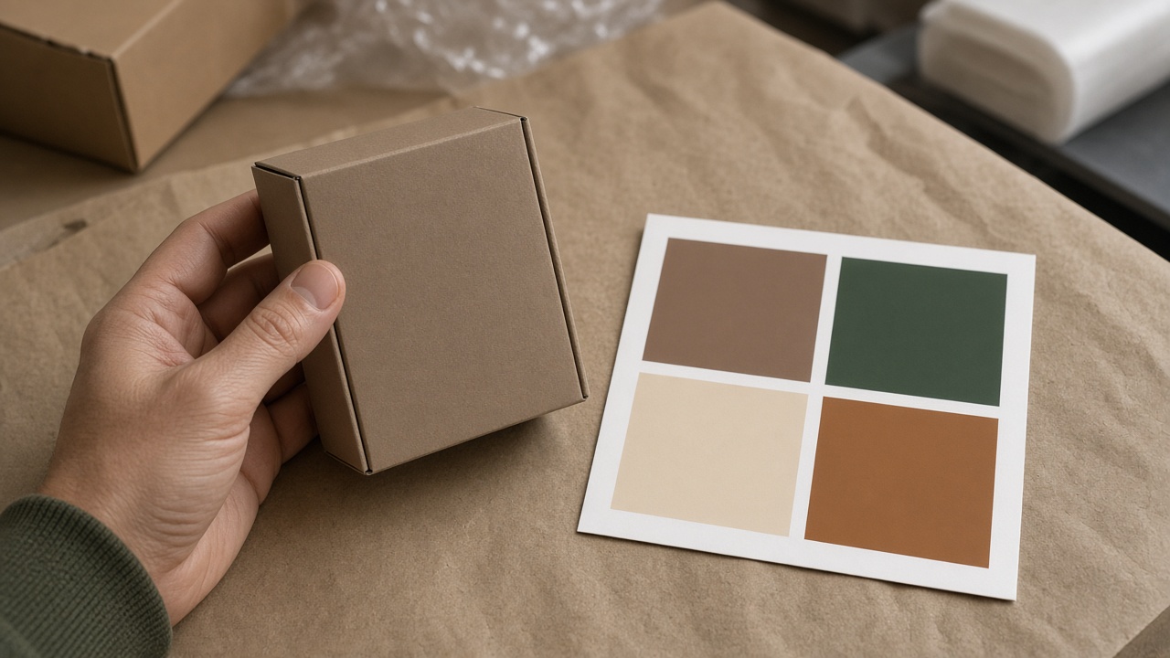
Checklist for talking to the printer (avoid vague disputes)
When you send files or approve a sample, a short brief helps both sides share one measuring stick:
Substrate + weight + finish (matte/gloss/none).
Target color: CMYK/Pantone or “match approved sample dated … / code …”
Which images/logos may have contrast adjusted at RIP, and which must stay untouched.
Approval conditions: under what light you view the sample, and how long you have to respond.
File version (filename + date) currently being proofed.
This kind of brief reduces “we see it redder / you see it lighter” arguments because you anchor on substrate and color codes instead of a 3D image.
When is color shift a plant fault — and when is it wrong expectations?
Usually leans toward expectations / approval process: approving only on 3D; proofing on different paper; sending RGB straight through; no target color written down; viewing samples under shop lights at night.
Usually leans toward production needing to fix: clear shift vs a signed proof on the same substrate; misregister; dirty ink; bulk run clearly different from the approved proof sheet with no notice.
Separating these two groups helps the shop know when to request a reprint, and when to adjust expectations and the file process before the next order.
A situation shops often run into
A milk-tea shop approves a 3D mockup of a takeaway box: brand blue on the phone looks “on identity.” The plant proofs on matte-laminated kraft — the blue goes muted, the logo less punchy. The shop asks for a reprint “like the 3D.” The plant ups the ink; round two is darker but still not like the screen because kraft does not glow. Both sides burn another sample cycle.
A better path: accept the 3D preview only to lock layout; lock color on the printed matte-kraft proof; write the approved CMYK into the brief for the bulk run. On the next order, the shop sends the exact signed file version and color code — fewer “why doesn’t it match the photo” debates.
Where does Printaz sit in the color story?
While designing and previewing on Printaz, treat 3D/preview as a shape & layout reference; final color still needs confirmation with a hard proof / agreement with the plant. Printaz helps shops build and edit mockups quickly and export files toward the printer — but it does not replace physical color approval when the job is brand-critical.
Combining web preview + print-time color control means fewer cycles of “looks great on the laptop – box is off in real life.”
Need advice before approving a print sample: [email protected].
Quick summary
Pretty 3D ≠ a print-color certificate; RGB/screen differs from CMYK/paper.
Substrate, finish, and viewing light all change how color feels.
Use 3D to approve layout; use a hard proof on the real substrate to approve color.
A clear tech brief (profile, substrate, color code, file version) reduces disputes.
Printaz supports design & preview; production color still needs a confirmation step with the plant.
Share this article