
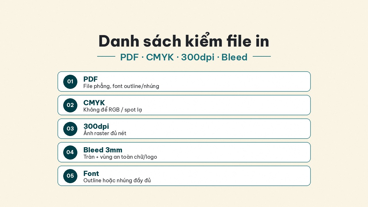
Print-file checklist: PDF, CMYK, 300dpi, and 3mm bleed
Five pillars before you send files to a plant: PDF export, CMYK, 300dpi, ~3mm bleed, convert/embed fonts — avoid costly reprints for labels and multi-industry packaging.
A beautiful design file sent with the wrong specs is wasted work: the plant rejects it, asks questions for a week, or prints broken type / white edges / dull color. This checklist packs the five pillars print shops use most — rewritten for shops and brands making labels, stickers, boxes, and catalogues across industries, not F&B-only.
Use it when you send files to a traditional printer or when you prepare artwork before ordering on Printaz. Printaz does not claim live auto file-check / automatic print-ready export — keep this checklist habit anyway.
Why checklist before you send?
Every fix–ask loop burns launch time. Small orders hurt more: traditional plants sometimes prioritize large lots; a broken file slides to the bottom of the queue. The five-pillar checklist lets you speak prepress language — “CMYK PDF, 300dpi, 3mm bleed, outlined fonts” — instead of “it looked fine on my laptop.”
For brands with many SKUs (cosmetics, mother & baby, fashion, retail, education), standardizing the checklist once and copying it to every order is cheaper than hiring someone to firefight each time.
Pillar 1 — Export PDF (do not send raw PSD/AI unless asked)
PDF keeps layout, fonts (when embedded/outlined), and images in one package plants open reliably. PNG/JPG/DOCX often shift color, break images, or drop fonts on larger formats.
Do: PDF/X or print-quality PDF per plant request; if originals are required → zip + note the exact app and version (e.g. Illustrator 2024).
Avoid: screenshots only; Word/PowerPoint as the “final print file”; cloud links that expire or lack download permission.
Naming tip: SKU_product-name_size_v03.pdf — avoid final_final2.pdf that confuses prepress about versions.
Pillar 2 — CMYK, not leftover RGB
RGB is for screens; printing RGB often looks shifted / dull / washed vs expectation. In Ai / Ps / Id: Document Color Mode → CMYK before you finalize. On PDF export, choose a print destination / PDF/X when the plant asks.
For why shift happens and which colors are hard: see Why print color shifts from the screen. Remember: a 3D mockup is not a CMYK soft-proof — color checklist and layout checklist are two different jobs.
Pillar 3 — Key images ≥ 300dpi
Below 300dpi you risk blur, jaggies, and breakup on large formats or close-up box faces. Photoshop: Image → Image Size → Resolution = 300 (at true print size, not “web size”).
A 72dpi web download scaled up will not magically become sharp — replace the source or redraw the logo as vector.
Practical note: tiny UI icons on a small sticker can be lower; hero images / box faces / product photography should not compromise. Vector logos (outlined AI/SVG) always beat raster for crisp type and marks.
Pillar 4 — About 3mm bleed on each side
Bleed is the extra area beyond the trim so cutting does not leave white edges or chop content. Missing bleed → white trim or “bitten” logos.
Illustrator / InDesign: set 3mm bleed each side; extend backgrounds / art to the bleed edge. Keep critical type and logos inside the safe zone (often ≥ 3mm inward from trim). For complex die-cut stickers, ask the plant for bleed along the die — curved edges sometimes need even surplus along the cut path.
Pillar 5 — Convert / outline fonts or embed them
No convert / no embed → another machine missing fonts → missing or wrong type. Illustrator: Create Outlines (Ctrl+Shift+O). InDesign: Create Outlines or Embed Fonts on PDF export.
Keep an editable master on your machine; the plant-bound file should “lock” type. Font license blocks embedding? Outline or ask the plant for a substitute before printing.
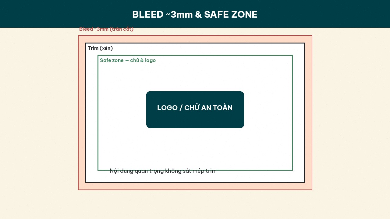 ~3mm bleed and a safe zone keep type/logos safe at trim.]
Quick checklist before you hit send
ItemOK?NotePDF (or original + zip as required)☐Not only PNG/DOCXDocument / export in CMYK☐Neon brands: call out separatelyMain images ≥ 300dpi☐At true print size~3mm bleed + safe zone☐Art to bleed edgeFonts outlined or embedded☐Keep editable masterSize / dieline matches SKU☐Match the dieColor notes / reference sample☐Avoid “match my phone”
Print this table or save a Notion/Sheet template — marketing fills it before design handoff.
Traditional plant vs ordering on Printaz
Traditional plants: often require a clean PDF and sometimes MOQ. The five pillars are your ticket in. Large qty + locked artwork may lean offset; trial runs lean digital — see Digital vs offset.
Printaz (printaz.vn): design on the web, review a 3D mockup (layout — not a CMYK soft-proof), order from 1 run, no MOQ. If you upload / bring external artwork in, still ensure CMYK–dpi–bleed–fonts first. Need a quick human review: Get a quote via [email protected]; want to DIY: Start free.
Failures that still happen with “a PDF”
PDF that is still RGB inside.
Bleed set in the document but art not extended.
Partial font embed; plant machine missing a subset.
Dieline / size 1–2mm off the real die.
Forgetting white underprint notes on clear labels.
Sending the wrong version (v2 instead of approved v5).
When a plant rejects you, do not only ask “what to fix?” — ask which of the five pillars failed. This series also covers 5 file mistakes that get rejected or force costly reprints.
Summary
Five pillars: PDF · CMYK · 300dpi · 3mm bleed · outline/embed fonts. Hit all five before sending = fewer back-and-forths and reprints. The same checklist serves labels–stickers–packaging across industries. Start on printaz.vn — Start free / Get a quote — [email protected].
Share this article