
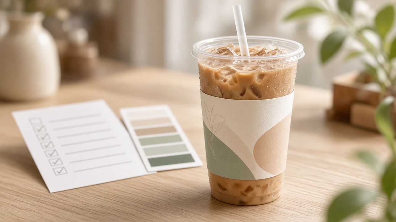
Checklist before printing cafe & milk-tea cup labels
One bad cup-label run makes a whole batch of drinks look bad. Checklist for size, print-ready files, content, substrate, and proofing for cafes & milk-tea shops.
One bad cup-label print run makes a whole batch of drinks look bad: labels crooked, off-brand color, type too small to read on cold cups. For cafes and milk-tea shops — where menus change by season and label runs are medium-sized — every file-revision cycle with the plant costs time and money.
The checklist below helps owners and design owners send to the plant (or build in an app) with fewer rework rounds. At the end: when to DIY, when to hire, and which part Printaz supports.
1. Lock the correct label type and wrap position
Not every “cup label” shares one size. Body wraps, lid labels, small logos on straws or sleeves — each has different dimensions and substrate.
Measure the real wrap circumference / height on the cups you use (PET, paper, hot cups). Don’t take a size “guessed from a sample photo online.”
Leave edge overrun (bleed) per plant requirements. Missing bleed means white edges after cutting.
If the shop uses multiple cup sizes (S / M / L), keep a separate checklist per size or confirm the plant can scale safely.
Switch cup suppliers → re-measure before reprinting old labels.
2. Print-ready file, not a file that only “looks good on screen”
Artwork that looks great on a phone is not necessarily ready for press.
Prefer vector or high-resolution files that cover the real label size. Don’t stretch logos from Facebook / Zalo.
Print color: work in CMYK (or the plant’s required profile). RGB on screen is usually deeper and more vivid than print.
Fonts: outline / convert to curves if sending a design file; avoid fonts the plant machine doesn’t have.
Name files clearly, for example:
tem-ly-tra-sua-size-90x50-cmyk.pdfinstead offinal_v7_latest.ai.
3. Label content: readable in one second
Cup labels are seen while holding a drink, waiting in line, or taking a photo — not while sitting down to read a brochure.
Logo + item name / price / slogan: pick at most 1–2 primary messages.
Type that is too small “disappears” when the cup is wet or fogged.
If there is a QR / link: test with a phone camera on a hard proof, not only on a screen mockup.
Don’t cram too many promo lines — customers won’t read them all, and layout gets messier.
4. Real substrate and real quantities
Waterproof / oil-resistant labels if you sell cold cups, milk tea, oily toppings.
Adhesive suited to the surface (PET plastic vs paper). Weak adhesive → labels peel when held; overly strong adhesive on some surfaces can leave ugly marks when removed.
Proof 50–100 labels before running thousands — F&B seasonal menus change fast.
Estimate quantity from real weekly sales, plus a small buffer — avoid leftover labels for items you’ve discontinued.
5. Approve one hard proof before bulk
Proof on the exact cup type you sell. Compare color to brand guidelines or cups already in use. Only go bulk once it’s OK. This step is far cheaper than scrapping a whole off-color label run.
Approve under shop lighting (order counter), not only under a desk lamp.
Check labels when the cup has ice / condensation if you sell cold drinks.
Photograph and save the OK sample so next time you can compare versions.
Quick tick checklist before send / order
Correct label type + correct size for the real cup?
Bleed + type/logo safe zone?
File sharp enough, print-oriented color, fonts outlined?
Content minimal, QR tested?
Substrate / adhesive suited to cold or hot cups?
Already hard-proofed (or a clear reason to skip proofing)?
When to DIY, when to hire a designer
DIY / template: change item name, price, CTA on a label frame with size and brand already locked.
Hire: a complex new label set, custom illustration, first-time tight matching for a large chain.
Ask the plant: technical adjustments (adhesive, finish, die) — not brainstorming slogans word-by-word over Zalo.
Example: seasonal combo labels — lean timeline
Suppose a milk-tea shop runs a 2-week combo:
Day 1: measure the size-M cups in use, lock body-label size + waterproof substrate.
Days 1–2: edit the template (combo name, price, accent color), preview, export print-ready.
Day 2: proof 50–100 labels, apply to iced cups, test QR and adhesive hold.
Day 3: OK → run enough for 2 weeks + a small buffer; keep the master so next week you only change price if needed.
If you skip proofing to “save money,” the risk of scrapping thousands of off-color or peeling labels is usually far more expensive than 50 sample labels. With fast-changing menus, a short proof + reusable master is how you keep sales rhythm without depending on a long Illustrator cycle.
FAQ
Can size-S labels share a file with L? Only after checking type isn’t too small / too large and the plant confirms scaling. Safer: a separate master per size.
Print color differs from Canva — whose fault? Usually RGB vs CMYK expectations, or different paper/lighting. Hard-proof before blaming the plant.
Do I need Illustrator? Not required if you have a correct-size template and print-ready export. Illustrator helps when building a complex master the first time.
Wrap-up — Printaz
The checklist above reduces file ping-pong between shop and plant — the exact pain printers hit when clients send wrong formats or small jobs with endless revisions. If you want to skip one-off file sends and endless Illustrator edits, you can pick a cup-label template, edit in 2D, and export print-ready on Printaz.
Try designing cup labels on Printaz · or contact [email protected] for quotes by size and quantity.
Share this article