
Gorgeous 3D mockups, shifted print — how to use mockups the right way
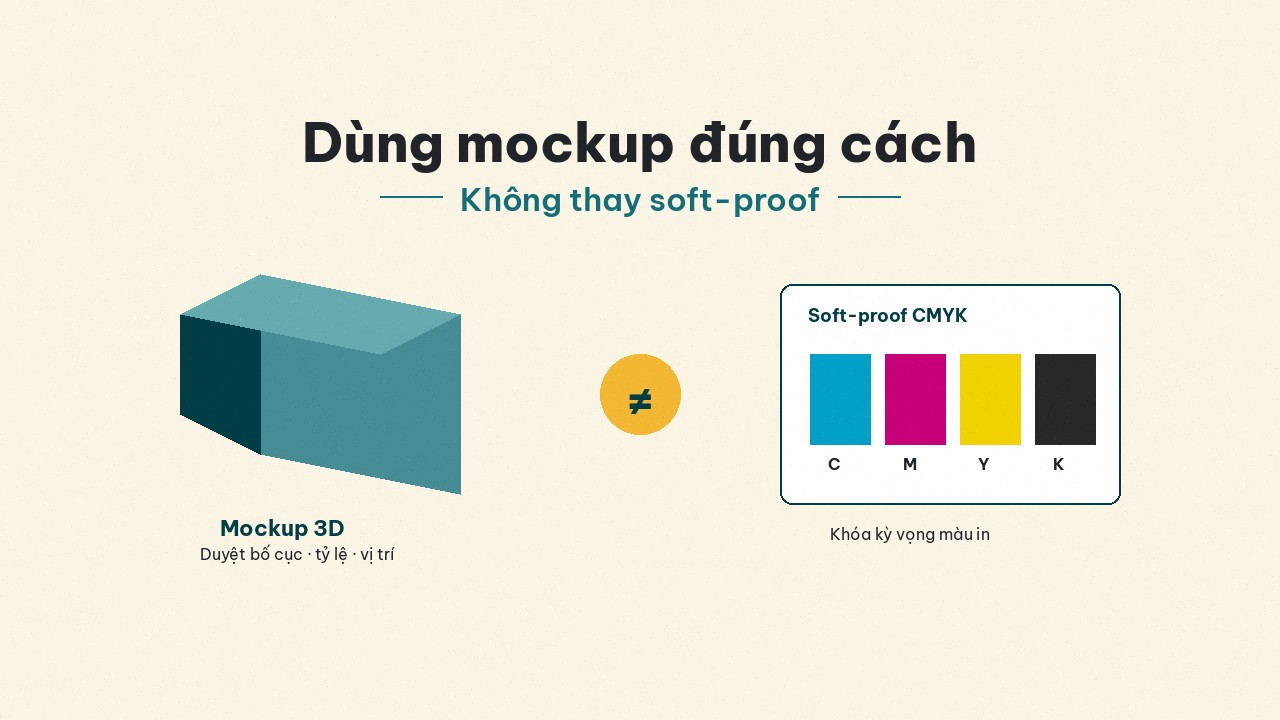
3D mockups are for layout approval, not CMYK soft-proofs. A 4-step process to reduce color shift for labels and packaging on Printaz.
A web 3D mockup looks “on brand”: flattering camera angle, studio light, logo placed perfectly. The boxes or labels in hand shift in color or feel completely different. The mockup did not “lie” — you used it for the wrong job.
This article adds a how to use angle (a complementary slug to the existing VIP post on “beautiful 3D but shifted boxes”): what mockups are for, what they are not, and a 4-step process to reduce risk for labels–stickers–packaging across industries on Printaz — cosmetics, fashion, retail, education, mother & baby, not F&B-only.
What 3D mockups are great at
Approving layout: type scale, logo placement, edge margins, readability from a distance.
Approving dieline / structure: which face prints what; whether lid–body–base match intent.
Aligning internally / with an agency: “lock this layout version.”
Marketing / pitching an idea before you spend on samples.
That value is real — do not abandon mockups just because you once saw a color shift. Sales still needs 3D images to pitch; just do not treat those images as a “color contract” with the plant.
What 3D mockups cannot do
They do not replace a soft-proof tied to paper–press–ink profiles.
They are not equal to a printed sheet / real sample on the final substrate.
They do not fully recreate CMYK gamut, kraft absorbency, gloss/matte laminate, or UV ink.
They are not generative AI “guessing print color” — no matter how pretty the render.
Short version: mockup ≠ CMYK soft-proof. Put that line in your approval checklist if teams argue “why is it different from the mockup.”
Why your eye trusts the mockup more than paper
RGB screens are wide and bright; mockups often render on white / studio light; your eye learns the “vivid” version. Paper absorbs ink, kraft kills saturation, matte coating softens color. For the color-system detail: Why print color shifts from the screen.
Another trap: approving a mockup on a phone in sunlight, then comparing a box under warehouse lights — two lighting conditions that unfairly blame the plant. Compare sample and production under the same lights when you can.
A 4-step approval process that works
Step 1 — Approve layout on the 3D mockup
Only ask: is type large enough? Is the logo inside the safe zone? Does the back have legal copy / barcode space? Will a fold or window cover anything? Do not sign “final color” at this step.
On Printaz, spin the 3D mockup to catch layout issues early — cheaper than fixing after the press. Invite someone who has never seen the file (sales, founder): they often catch “type too small” that designers are blind to.
Step 2 — Normalize the file with the print checklist
PDF, CMYK, 300dpi, 3mm bleed, outlined fonts — see Print-file checklist and 5 file mistakes that get rejected. A pretty mockup will not save an RGB file missing bleed.
If artwork is built on the Printaz web editor, still check safe zone and version before ordering — Printaz does not claim live auto file-check.
Step 3 — Lock color with a sample / proof
Digital often turns samples around fast; large runs may need an offset signed sheet (see Digital vs offset). Write: “match sample #…,” not “match the web mockup.” Neon / spot brands: tell the plant before the run.
For clear labels, ask about white underprint — web mockups sometimes hide how light type disappears on a transparent base.
Step 4 — Scale only after the sample is signed
Increase quantity only after sign-off (name + date). On Printaz you can order from 1 run, no MOQ to learn color on small quantity before you scale — less painful than jumping straight to thousands of offset pieces because “the mockup looked great.”
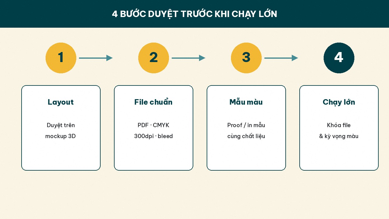 steps: layout → clean file → color sample → scale.]
Multi-industry situations you will recognize
Cosmetics: glossy white box mockup → real kraft / matte couche: “premium” feel differs. Sign a sample on the real material.
Fashion: hangtag mockup on studio white → real board stock slightly warm; accept it or change stock.
Retail: many promo-label versions — approve layout on mockup, lock one background color with a sample, then clone text versions.
Events / education: names change by day — mockups show whether long names overflow; keep color tied to the signed sample.
Checklist for talking to the plant (avoid vague disputes)
“Mockup is layout-only; color follows the sample / CMYK PDF we sent.”
Paper / label material (kraft, couche, plastic, clear) noted?
Gloss or matte laminate?
Clear labels need white underprint?
Who signs the final sample (name + date)?
Does the print file version match the signed sample?
When shift is a plant issue — vs wrong expectations
Wrong expectations: comparing an RGB mockup to real kraft; demanding 100% neon from process CMYK; approving on a vivid display. Possible plant / process issues: clear mismatch vs a signed sample; wrong agreed Pantone; printing the wrong file version. Separate the two before you open a ticket — it saves relationships and time.
Where Printaz fits in the mockup story
Printaz (printaz.vn, Vinaco) lets you design packaging / labels / stickers on the web and review a 3D mockup for layout, then order from 1 run. We do not claim mockup = soft-proof or live auto print-ready export. Use the right tool: mockup for layout, real sample for color.
CTAs: Start free — build layout + view 3D; Get a quote / [email protected] — when you need advice on quantity, materials, or a large run.
Summary
3D mockup = layout & dieline approval. Soft-proof / printed sample = color lock. Mixing the two is the root of “beautiful mockup, shifted print.” Follow the 4 steps, clean the file, sign a sample, then scale — especially easy with no MOQ on Printaz. Start free / Get a quote — [email protected].
Share this article