
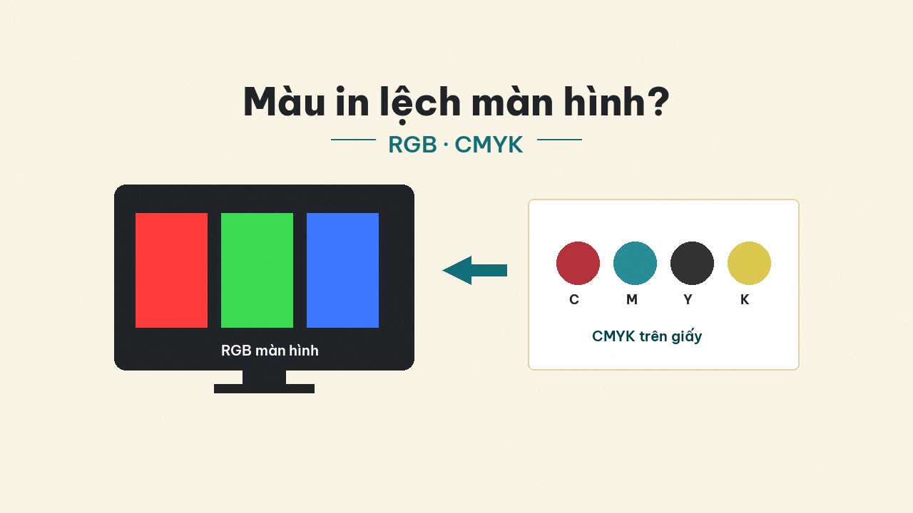
Why print color shifts from the screen? RGB, CMYK, and realistic expectations
A deeper look at why screen color differs on paper: wider RGB gamut vs CMYK, uncalibrated displays, paper–ink–coating — and how to reduce shift before a large run.
You approve a neon-blue logo on a laptop — vivid, “on brand.” The boxes or labels arrive duller, slightly muddy, or shifted toward green. The team blames the printer; the printer says the file was RGB. Both can be partly right. Screen-to-print color shift is almost always about color systems + devices + materials, not only “the plant printed wrong.”
This article goes deeper than a basic RGB/CMYK compare: why shift happens, which colors are hard to print, and what shops and brands should do before a large run — for labels, stickers, boxes, and catalogues across industries.
RGB and CMYK: two different light worlds
RGB — screen color
Computers, phones, and TVs make color by mixing emitted light red–green–blue (R–G–B). Higher values mean brighter color. The gamut is usually wider than printing inks — especially neon, electric blue, and vivid purple.
RGB fits web, social, and digital design. Sending raw RGB to a press without a deliberate convert / preview often yields color that feels “duller than expected.”
CMYK — ink color
Digital and offset presses use C–M–Y–K inks (cyan, magenta, yellow, black). Ink absorbs light on paper: more ink means darker / denser color. The gamut is narrower than RGB — many screen colors cannot be reproduced 100%.
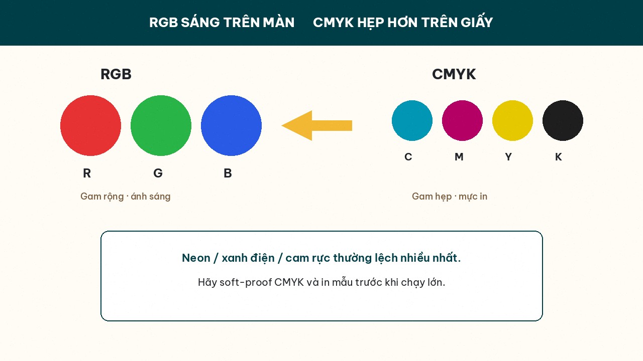 screen vs narrower CMYK on paper.]
RGBCMYKSystemEmitted lightInk absorbing light on paperGamutWiderNarrowerFeelBright, vividSofter, calmer, sometimes “dull”Neon / electric blueVery bright on screenUsually darker / flatter in print
Four common causes of color shift
1. The file is still RGB when it goes to print
Document Color Mode is still RGB; the PDF export did not force CMYK; the logo image is still sRGB. The RIP converts with a default profile — you do not control how it converts. Design (or deliberately convert) to CMYK first when the destination is print.
2. The display is not calibrated
Two laptops open the same file differently. Max brightness, a “vivid” preset, or Night Shift at night trains your eye on a color that never exists on paper. Soft-proof on a calibrated screen is still an estimate, not a substitute for a printed sheet.
3. Paper, gloss/matte coating, and ink type
The same CMYK on glossy couche differs from kraft; gloss laminate pushes contrast differently than matte; UV ink differs from oil-based offset. A “small” shift between a white web mockup and a real kraft box is normal.
4. Wrong expectations for “unprintable” brand colors
Neon brand blues, ultra-vivid purples, Instagram-hot oranges — in CMYK they often must be mapped to the nearest in-gamut color. That is not a plant fault if you never locked Pantone / spot ink or signed off a soft-proof plus physical sample.
A 3D mockup ≠ a CMYK soft-proof
Web 3D mockups are excellent for approving layout, type scale, logo placement, dielines. They do not replace a soft-proof tied to paper–press profiles, and they are not equal to a printed sample. Looking great on a mockup but shifting in print usually means you approved with the eye on RGB/render — see our companion article on using mockups the right way.
How to reduce shift before a large run
Step 1 — Work in CMYK early
In Illustrator / Photoshop / InDesign: Document Color Mode → CMYK. Convert key images with intent; do not “let the press handle it.” On Printaz, treat on-web artwork color as a layout guide; still order a physical sample if brand color is strict.
Step 2 — Know which colors are hard
List 2–3 non-negotiable brand colors. If they sit in neon / hyper-saturated zones → talk to the plant about spot color, or accept an adjusted CMYK version and sign a sample.
Step 3 — Print a sample / proof before high volume
For large runs (hundreds–thousands of boxes), one sheet or one sample box is cheaper than a whole skewed lot. Digital often turns samples around fast; offset after make-ready should also include a signed sheet if color is critical.
Step 4 — Do not trust the screen 100% — brief the plant clearly
Send files with notes: “match sample #…,” “acceptable ΔE range…,” or “logo color follows the CMYK already converted in the PDF.” Avoid vague disputes like “it does not match my phone.”
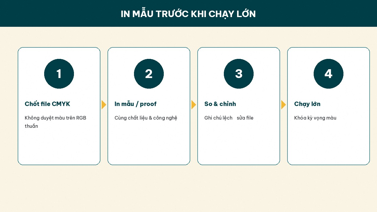 before a large run locks color expectations.]
Printaz and the color story
On Printaz (printaz.vn) you design packaging / labels / stickers, review a 3D mockup to lock layout, then order from 1 run — no MOQ — ideal for a trial print so you see real color. Printaz does not claim auto file-check or a CMYK soft-proof that replaces the plant; mockups are a layout tool. For picky brand colors: combine a sample run with advice via Get a quote / [email protected].
CTAs:
Try layout and order a small sample: Start free
Need color / quantity advice: Get a quote — [email protected]
Color-expectation checklist (stick it near your screen)
Is the file / document in CMYK (or deliberately converted)?
Is the working display overly “vivid” / too bright?
Have you viewed color on paper / substrate close to the final product?
Any neon / spot colors to call out with the plant?
Have you separated 3D mockup approval (layout) from color approval (proof/sample)?
Summary
Screen-to-print shift happens because RGB is wider than CMYK, screens are uncalibrated, paper–ink–coating differ from renders, and some brand colors are simply hard to print. Reduce risk with early CMYK design, honest gamut limits, samples before large runs, and never treating a 3D mockup as a soft-proof. Start on printaz.vn — Start free / Get a quote — [email protected].
Share this article